In Part 8 of this series, we presented :
Look at Me! And Pay Attention!: Giving the Nod to 13 Centers of Interest
Fantasy Game Art – A Theory of Composition
In Part 1 of this series – A Fifth Dimension: The Hidden Axis of Symmetry, we listed five types of symmetry common in Fantasy Game Art. And, here below, we recap those points and expand our definition of symmetry to include :
-
Type A or left-right symmetry (like the letter A)
-
Type B or top-bottom symmetry (like the letter B)
-
Type H or “dual axis” or left-right + top-bottom symmetry (like the letter H) also exists
-
Type N or northwest-southeast diagonal/rotational symmetry (like the letter N)
-
Type Z or northeast-southwest diagonal/rotational symmetry (like the letter Z)
-
Type Q or “quasi/quirky” non-symmetry or partial symmetry (like the letter Q) also exists, and …
-
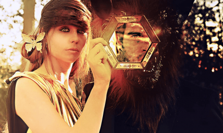
Type R or “reflex” (reflexive, inter-dimensional) symmetry which allows hidden objects to be revealed, as is the case when a literal mirror is introduced into a painting.
And, while we are expanding our definition of symmetry beyond its normal bound, we might also say that …
-
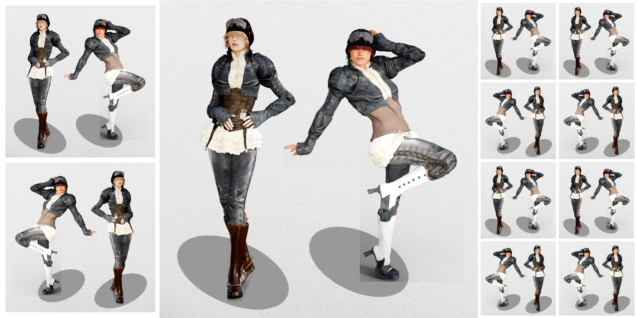
Type P.1 or parallel symmetry (1) could be argued to exist. Which would entail, for example, two figures standing on either side of a vertical axis of symmetry. With each character, identical in aspect, having their right hand extended to the side and holding a sword – but without requiring the two halves of the painting to be mirror images of one another. That is, the character on the left could just as easily be switched with the character on the right without causing any change at all in the art work.
And, if we allow that this type of symmetry exists, then we might also have …
-
Type P.2 or parallel symmetry (2). Which would differ from Type P.1 by allowing the characters mentioned above to rotate – that is, to rotate freely in 3 dimensional space. Under this arrangement, we might consider a knight dressed to go into battle on the left side of a painting (showing us his face) and his identical but rotated self as presented on the right side of the same painting (showing us his back), to be symmetrical with one another.
All told, symmetry is a powerful tool because we find it in ourselves and in others and we look for it, consciously or otherwise, wherever we go. There is something very human in this psychology and without it, without at least a taste of symmetry in some of our art, we could not fully detail our human existence nor transcend that existence into the realm of fantasy. And isn’t that what we want in the first place? The suspension of disbelief? The raw power of our childhood imaginings brought to life? I contend that we do. And I believe that any fairy creature reading these words would as well.
– – –
In Part 2 of this series – Classic Sources of Light and Shadow, we explored such natural light sources as the sun and moon as well as man-made light sources and genre specific lighting. Ask yourself, What color light do you see when you study a scene? And what color are its shadows?
– – –
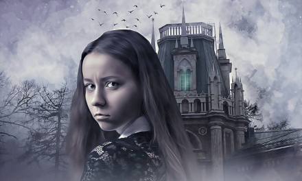
In Part 3 – Theme and Content: A Brief Catalog of Fantasy Symbols, we discussed our understanding of Fantasy Game Art and how it is improved through a knowledge of the symbols being used. In this post, the symbolism of fairies, unicorns, and dragons was especially highlighted.
– – –
Then, in Part 4 of this series – Altered States: When to Alter Reality and When It’s Best to Leave it Alone, we asked the question, How much is too much when it comes to exaggeration? And we discussed a variety of ways that size, quantity, and intensity could be altered – either increased or decreased – to support our Fantasy Game Art objectives.
– – –
In Part 5 – The Importance of Being Blue: Contrast and the Human Eye, we turned to a number of experts for their advice. To fashion designer Edith Head, the experts of the NTSC, and to the Web Content Accessibility Guidelines.
– – –
For Fantasy Game Art – Part 6 – Perceiving Mass and Void: How to Balance the Proportion and Weight of Each of Your Elements, we talked about our childhood fears. What we were afraid of and why we were afraid in the first place. And then we examined the importance of what we called a circle (or in 3d game art, a sphere) of protection.
But first, we laid the groundwork by outlining some general principles of artistic balance. Particularly when it comes to size, shape, color, position, and recessivity. That is, an object’s tendency to recede (or not) into the background in a given work of art.
And a lot of that discussion boiled down to simple common sense. The things a child could tell us :
• Large objects weigh more than little tiny ones,
• A ball weighs less than a block of wood (because a block of wood has corners and those corners must weigh something, right?),
• A bright red lollipop is better than a colorless one because you get more, and
• Birds weigh less when they are flying (or how else could they fly?).
And the funny thing is, that child would be right. At least in a visual or perceptive sense.
– – –
In Part 7 – Trick Photography: What It Is and What It Isn’t, we decided to go to the movies!
And we were prompted to think of the dwarves in The Hobbit, and of Harrison Ford taking a leap of faith onto an unseen bridge in Indiana Jones and the Last Crusade, and of the flying debris that surrounded Richard Dreyfuss as he sat in his pickup truck in Close Encounters of the Third Kind. And we even mentioned Fred Astaire as he danced across the room, up the wall, and onto the ceiling in the 1951 film, Royal Wedding.
How did they do those things? And how much of it was trick photography?
– – –
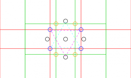
And finally, in Part 8 of our series – Look at Me! And Pay Attention!: Giving the Nod to 13 Centers of Interest, we recalled our school days and those bushy haired professors that stood before us and explained things we didn’t grasp at all. Things that were supposedly right in front of us: Where to focus our attention and how.
Math fans might like this post. We included a few comments on the use of the golden mean and even mentioned the Fibonacci sequence. But not to worry, it’s not all about the math. It’s as easy as telling time. 🙂
– – –
There you have it. A detailed theory of composition. I hope you find some of these points useful in your Fantasy Game Art, and if you do, please drop us a line or feel free to comment through our website.
We can also be found on Facebook, Twitter, and YouTube. Send us a snapshot of your artwork and we’ll post it online. The world needs more great Fantasy Game Artists, just like you. So, go create a masterpiece!
