In Part 4 of this series, we presented :
Altered States: When to Alter Reality and When It’s Best to Leave it Alone
– – –
You caught me. This one took some research. And I’ll have to admit that when I first sat down to outline this series I only vaguely remembered something about the color blue. How it was important in some way to contrast and our human perception of the world.
I didn’t really remember just what that something was but it had to do with the NTSC and early television transmission protocol. Or something like that. And then my wife reminded me that Edith Head, winner of an amazing 8 Academy Awards for motion picture costume design, wore blue tinted glasses. Maybe she was on to something. And maybe we really do have something useful to talk about in this post.
So, here goes!
Did you know that certain colors of light are more important to our perception of the world in general and of fantasy art in specific? You may just be surprised. (I sure was.)
Consider these points (which touch on contrast):
Because she wanted to limit the colors of light that would reach her eye while maintaining a high degree of contrast – in much the same way that a (possibly filtered) camera lens would limit the quality of light reaching the film, especially in the days of black and white photography.
- Experts state that the NTSC (National Television System Committee) paid special attention to the color blue when first devising their television standard. How? And, Why?
By limiting the quantity of “blue light signals” that were transmitted in comparison to those for other colors of light. Especially in the broadcast standard. This was done because the cones in the human eye that detect various light frequencies are most sensitive to blue light. Less of this “light color information” was needed than that for other colors in order to properly reconstruct the image. In other words, blue light did a better job. Less was all that was needed.
- The Web Content Accessibility Guidelines (WCAG) 2 recommends blue as a high contrast color against a white page. Really? In comparison to what?
Well, in terms of contrast ratio, in comparison to white itself (1:1) which would be ridiculous – How could you ever see white on white? And in comparison to green (1.4:1) which isn’t much better. And to red (4:1) which begins to stand out, at least at fairly big point sizes. And to blue (8.6:1) which really does stand out, even at small point sizes. And finally, to black (21:1) which has a contrast ratio to white which is high enough to read at almost all point sizes.
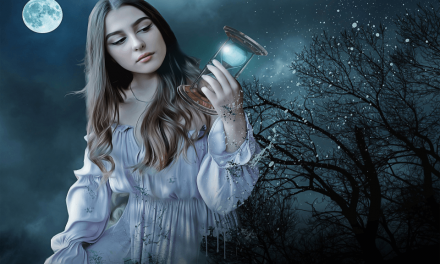
- And, I’ll go out on a limb here, and say that we should also consider the use of the color blue in what is commonly known as the “day for night” film technique. What’s that all about?
Either the film stock itself (once developed), or the lenses and filters used during the filming process, can be tinted in such a way that the perceived or resultant image has a blue cast – reminiscent of moonlight – even when the film has been shot in broad daylight. This has been done in one way or another since before color film was possible and even before modern “talkies” became prevalent.
And we should also be aware of these bonus features of the use of blue in fantasy game art:
- Most persons would agree that the color blue has a certain psychological impact. And perhaps this is due to the super-abundance of blue in nature.
- And who as an artist can argue that there are not both cool and warm colors in our palette? And isn’t blue a cool color while red is a warm one? So, again, where would we be if we never used blue?
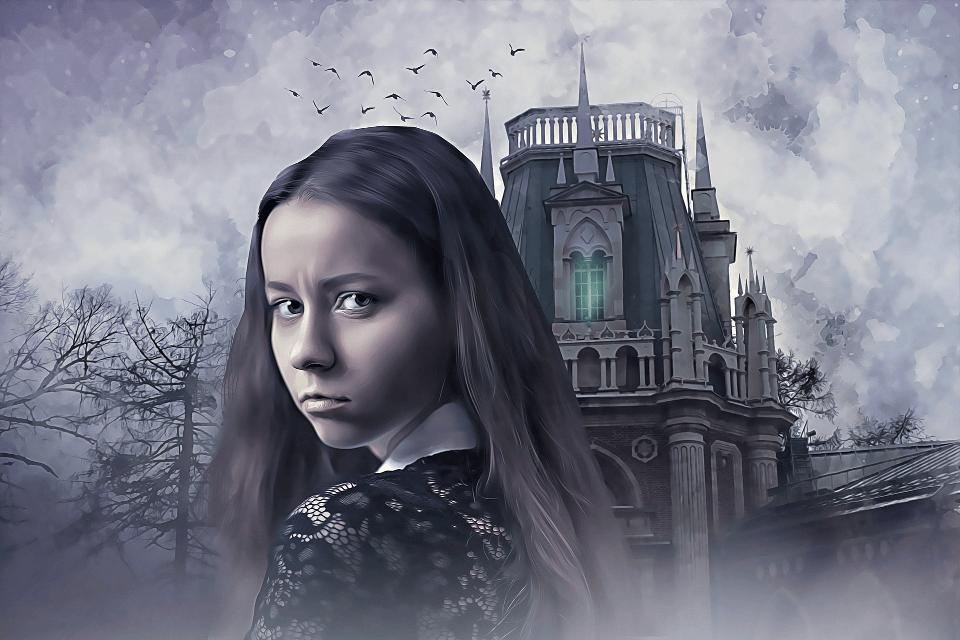
- And there exists an undeniable shorthand when it comes to our use of color. Think about it. Don’t most people make the following equations? Green = envy, life, and abundance. Blue = freedom, trust, and royalty. Red = passion, fire, and anger. And don’t we want blue – as a subtext for freedom, trust, and royalty – in our artwork? Sure we do. At least sometimes.
Phew! What a lot to think about!
But really, what are our takeaways here?
When it comes to fantasy game art, we are free to arrange our palette any way we like. But, if we ignore the color blue, we will certainly be limiting ourselves.
And a great deal of our artistic shorthand will be absent. As will the psychological impact of the color blue.
Shadows that could have been richer in color and higher in contrast may begin to look dull and lifeless – “muddy”, as they say.
And the edges of any feature that we try to project into 3d space may become ill-defined. Largely because the red/green color pair exhibits less contrast than does the blue/yellow color pair. Unless, of course, we resort to sharp-but-stark black and white images – strictly unenhanced by blue.
And, it goes without saying, that we will not be able to imitate nature. Not in a true-to-life manner. With full color, a blue sky, and streams of water (with blue-tipped spray) tripping over a pebbled stream bed.
But then again, this is fantasy. And anything goes, Right? Well, almost anything. And you never know (not exactly) what will succeed and what will fail before you try. But, if you would at least consider the foregoing (and likewise consider planting a tiny light bulb in your brain) perhaps these ideas will shine forth – unbeckoned as it were – and cause you to add a bit more blue to your next masterpiece. And I hope you do. It really is that important.
– – –
In Part 6 of this series we will present :
Perceiving Mass and Void: How to Balance the Proportion and Weight of Each of Your Elements
Have you ever been afraid as a child? Sure you have. We all have. And what were we afraid of? In this post we will examine the importance of what I will here call a circle (or in 3d art, a sphere) of protection.