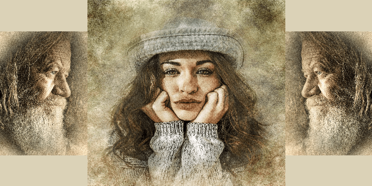
Have you ever been right there – right at the point of having your artwork come to life? Sure you have, remember? You were working late at night and sitting atop your favorite stool with your favorite beverage just off to one side. You took a sip and picked up that extra-fine horsehair brush that you’d been itching to use all evening but had reserved for the details around the mouth and eyes of your lead character, Brenda, that sassy city girl from Brooklyn.
Black, gray, rust, and soft clay were the colors you had chosen. Amber and a touch of hazel for the eyes. A little brick for the lips and … you still weren’t satisfied. It might have been the light, so you adjusted the clamp and swung the head a little closer. But really, it was that cross-eyed stare that hits us all when we work too late. You closed your eyes, stepped off the stool, and stood back. Then you stretched, yawned, and looked away into the shadows across the room and then back at your creation. No, it wouldn’t do to wait til morning.
So you sat back down, finished off your beverage and started again. Then it hit you. “Ah! It’s the lips,” you said aloud. And you were right. They were just too symmetrical, and that sameness didn’t fit with the rest of her. Phew! And to think, you were about to pack it in for the night. And that would have been a shame. It was the subtle asymmetry of your creation that had excited you in the first place, the very thing that made Brenda real.
Now ask yourself (with a pencil in hand), How do I instill a degree of realism into all my characters? Well, you’re the artist. Trust yourself to know. But just in case you want to remind yourself, why not make a list of the things you could do. When you’re finished, your list might something look like this (and probably a whole lot better):
- Unless you have a good reason to do so, don’t make the two halves of the face exactly the same. (Or the two halves of the body, for that matter.) People don’t usually come that way.
- Concentrate on the little things. Details of jewelry, costume, and environment. (But don’t go crazy and lose sight of composition.)
- For some of your characters, consider adding an imperfection of some kind. A tiny scar, a mole, or a blemish. (But nothing too blatant or cliché.)
- And don’t shy away from prosthetics and appliances. Not every character needs them but there’s nothing wrong with a pair of glasses, or a set of braces, or even an eye patch. (But then again, not every character should look like a geek, an adolescent, or a pirate – should they?)
- Try to establish a fixed color palette and stick to it – most of the time.
- And generally, you should light your character in some conventional way and add shadow. (But, at the same time, don’t be afraid to experiment or try new things.)
- And finally, if you can capture an appropriate emotion in your artwork, go for it. That, more than anything else, will make your characters real.
There you have it. Life in a nutshell. 7 things you can do to improve the realism of your characters and keep them from all looking the same. You, as artist, have got to have your board game art just right. But not to worry. Right there, deep inside you, you already know how to make your characters come to life. Just trust your instincts, and pay attention to the mouth and eyes. Your characters may just be telling you something.


